Data Visualization
An integral part of the analysis of high-throughput data is its visualization to assess the data quality and to easily explore those large data sets for interpretation and hypothesis generation. Data visualization can further help to uncover hidden patterns and trends not apparent from table views.
What we offer
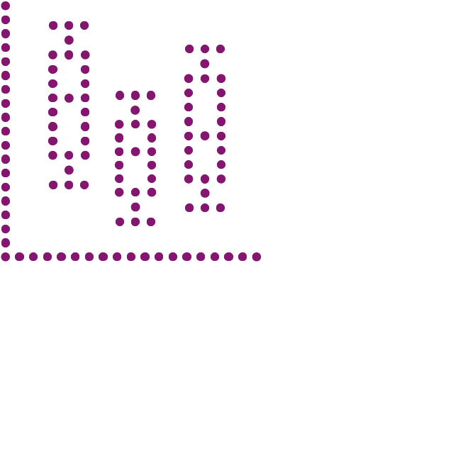
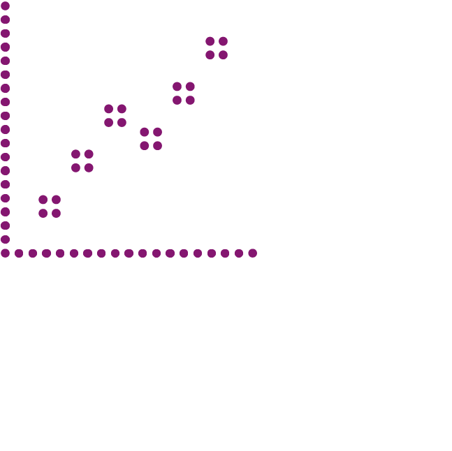
Quality assessment plots
The visualization of the obtained data set can help to assess the quality of the data, to identify outliers, potential sample swaps, and the performance of data pre-processing and normalization techniques. We offer a broad range of quality assessment plots such as correlation plots, scatter plots and the widely used boxplot.
Explorative data visualization
Due to the high dimensionality of high-throughput data, unsupervised exploratory analysis techniques are used to obtain a first insight into the dataset. If you want to learn more about your data we can help you with that, providing principal component analysis (PCA), t-distributed stochastic neighbor embedding (t-SNE) or clustering results.
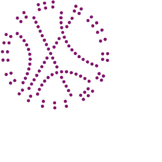
Integrative data visualization
Genomic data comprises a magnitude of information, and due to its high complexity, there is a need for sophisticated visualization methods and tools to generate new hypothesis and draw conclusions. Such datasets are easily represented with Circos plots and, in the more general form of a chord plot, the visualization style can also be used to integrate gene expression data with the results of pathway enrichment analysis. If you want to visually combine multiple data layers, the Circos plot and it derivatives are just the right plot for you. Let us know what kind of data you want to display and we will customize the plot.